다차원 데이터의 시각화
이 글은 Dipanjan (DJ) Sarkar(2018)의 “Effective Visualization of Multi-Dimensional Data”를 참고하여 작성하였으며, python 코드로 되어 있는 것을 R 코드로 변환하였다.
분석에 사용하고자 하는 데이터는 UCI Machine Learning Repository에서 제공하는 Wine Quality Data Set이다.
와인 품질 데이터는 2개의 파일 즉 레드 와인과 화이트 와인 데이터로 구성있다. 레드와인 파일에는 1,599개의 관측값이, 화이트와인 파일에는 4,898개의 관측값이 들어있다. 두 개 파일 모두 11개의 화학성분 변수와 1개의 품질 변수로 구성되어 있다.
- fixed acidity 비휘발성 산
- volatile acidity 휘발성 산
- citric acid 구연산(시트르산)
- residual sugar 잔당
- chlorides 염화물
- free sulfur dioxide 유리 이산화황
- total sulfur dioxide 총 이산화황
- density 밀도
- pH 산도(수소 이온 농도)
- sulphates 황산염
- alcohol 알코올
- quality 와인 품질(나쁨 : 0 ~ 좋음 : 10)
패키지 준비
library(tidyverse)
library(purrr)
library(psych)
library(grid)
library(gridExtra)
library(GGally)
library(ggExtra)
library(psycho)
library(plotly) # 3D plot
library(tokenizers)
library(imager)
library(datawizard) # for Standardize function
데이터 불러오기
레드와인 파일과 화이트 와인을 불러들인 후 데이터를 확인한다.
# data frame 형식으로 불러들이기
white_wine <- read.csv("winequality-white.csv", sep = ";")
red_wine <- read.csv("winequality-red.csv", sep = ";")

str(white_wine)
## 'data.frame': 4898 obs. of 12 variables:
## $ fixed.acidity : num 7 6.3 8.1 7.2 7.2 8.1 6.2 7 6.3 8.1 ...
## $ volatile.acidity : num 0.27 0.3 0.28 0.23 0.23 0.28 0.32 0.27 0.3 0.22 ...
## $ citric.acid : num 0.36 0.34 0.4 0.32 0.32 0.4 0.16 0.36 0.34 0.43 ...
## $ residual.sugar : num 20.7 1.6 6.9 8.5 8.5 6.9 7 20.7 1.6 1.5 ...
## $ chlorides : num 0.045 0.049 0.05 0.058 0.058 0.05 0.045 0.045 0.049 0.044 ...
## $ free.sulfur.dioxide : num 45 14 30 47 47 30 30 45 14 28 ...
## $ total.sulfur.dioxide: num 170 132 97 186 186 97 136 170 132 129 ...
## $ density : num 1.001 0.994 0.995 0.996 0.996 ...
## $ pH : num 3 3.3 3.26 3.19 3.19 3.26 3.18 3 3.3 3.22 ...
## $ sulphates : num 0.45 0.49 0.44 0.4 0.4 0.44 0.47 0.45 0.49 0.45 ...
## $ alcohol : num 8.8 9.5 10.1 9.9 9.9 10.1 9.6 8.8 9.5 11 ...
## $ quality : int 6 6 6 6 6 6 6 6 6 6 ...str(red_wine)## 'data.frame': 1599 obs. of 12 variables:
## $ fixed.acidity : num 7.4 7.8 7.8 11.2 7.4 7.4 7.9 7.3 7.8 7.5 ...
## $ volatile.acidity : num 0.7 0.88 0.76 0.28 0.7 0.66 0.6 0.65 0.58 0.5 ...
## $ citric.acid : num 0 0 0.04 0.56 0 0 0.06 0 0.02 0.36 ...
## $ residual.sugar : num 1.9 2.6 2.3 1.9 1.9 1.8 1.6 1.2 2 6.1 ...
## $ chlorides : num 0.076 0.098 0.092 0.075 0.076 0.075 0.069 0.065 0.073 0.071 ...
## $ free.sulfur.dioxide : num 11 25 15 17 11 13 15 15 9 17 ...
## $ total.sulfur.dioxide: num 34 67 54 60 34 40 59 21 18 102 ...
## $ density : num 0.998 0.997 0.997 0.998 0.998 ...
## $ pH : num 3.51 3.2 3.26 3.16 3.51 3.51 3.3 3.39 3.36 3.35 ...
## $ sulphates : num 0.56 0.68 0.65 0.58 0.56 0.56 0.46 0.47 0.57 0.8 ...
## $ alcohol : num 9.4 9.8 9.8 9.8 9.4 9.4 9.4 10 9.5 10.5 ...
## $ quality : int 5 5 5 6 5 5 5 7 7 5 ...두 개의 파일을 하나로 병합하는 것이 분석에 편리하기 때문에 병합에 필요한 변수를 먼저 생성한 후 하나의 데이터셋으로 병합하고자 한다.
# wine_type 변수 생성
white_wine <- white_wine %>%
  mutate(wine_type = "white")

red_wine <- red_wine %>%
  mutate(wine_type = "red")

# red wine과 white wine 데이터 행 결합
wines <- bind_rows(red_wine, white_wine)
quality 점수를 등급(low, medium, high)으로 변환한 새로운 변수를 생성한다.
wines <- wines %>%
  mutate(quality_label = case_when(quality <= 5 ~ "low",
                                   quality <= 7 ~ "medium",
                                   TRUE ~ "high")) %>%
  mutate(quality_label = factor(quality_label,
                                levels = c("low", "medium", "high")))
레드와인 데이터와 화이트와인 데이터가 무작위로 섞이도록 순서를 무작위로 변경한다.
# 데이터 순서를 무작위로  변경하기
wines <- wines[sample(1:nrow(wines)),]
head(wines)
## fixed.acidity volatile.acidity citric.acid residual.sugar chlorides
## 5031 7.1 0.18 0.39 15.25 0.047
## 4320 7.5 0.26 0.30 4.60 0.027
## 6315 6.7 0.15 0.32 7.90 0.034
## 3846 6.4 0.34 0.20 14.90 0.060
## 5925 6.4 0.24 0.26 8.20 0.054
## 5332 7.5 0.28 0.41 1.30 0.044
## free.sulfur.dioxide total.sulfur.dioxide density pH sulphates alcohol
## 5031 45 158 0.99946 3.34 0.77 9.1
## 4320 29 92 0.99085 3.15 0.38 12.0
## 6315 17 81 0.99512 3.29 0.31 10.0
## 3846 37 162 0.99830 3.13 0.45 9.0
## 5925 47 182 0.99538 3.12 0.50 9.5
## 5332 11 126 0.99293 3.28 0.45 10.3
## quality wine_type quality_label
## 5031 6 white medium
## 4320 7 white medium
## 6315 6 white medium
## 3846 4 white low
## 5925 5 white low
## 5332 5 white low# 와인 종류(레드, 화이트)별로 기본적인 기술통계량 보여주기
# psych::describeBy
subset_attributes = c('residual.sugar', 'total.sulfur.dioxide', 'sulphates',
'alcohol', 'volatile.acidity', 'quality')
describeBy(wines[,subset_attributes], group = wines$wine_type, fast = TRUE)##
## Descriptive statistics by group
## group: red
## vars n mean sd min max range se
## residual.sugar 1 1599 2.54 1.41 0.90 15.50 14.60 0.04
## total.sulfur.dioxide 2 1599 46.47 32.90 6.00 289.00 283.00 0.82
## sulphates 3 1599 0.66 0.17 0.33 2.00 1.67 0.00
## alcohol 4 1599 10.42 1.07 8.40 14.90 6.50 0.03
## volatile.acidity 5 1599 0.53 0.18 0.12 1.58 1.46 0.00
## quality 6 1599 5.64 0.81 3.00 8.00 5.00 0.02
## ------------------------------------------------------------
## group: white
## vars n mean sd min max range se
## residual.sugar 1 4898 6.39 5.07 0.60 65.80 65.20 0.07
## total.sulfur.dioxide 2 4898 138.36 42.50 9.00 440.00 431.00 0.61
## sulphates 3 4898 0.49 0.11 0.22 1.08 0.86 0.00
## alcohol 4 4898 10.51 1.23 8.00 14.20 6.20 0.02
## volatile.acidity 5 4898 0.28 0.10 0.08 1.10 1.02 0.00
## quality 6 4898 5.88 0.89 3.00 9.00 6.00 0.01단변량 분석 (Univariate Analysis)
1차원으로 데이터 시각화하기
wines 데이터에 있는 전체 변수 중 양적 변수들의 히스토그램 그리기
wines %>%
  keep(is.numeric) %>%   # only numeric (양적 변수만)
  gather() %>%           # convert to key-value(변수-값 형태)
  ggplot(aes(value)) +
  facet_wrap(~key, scales = "free") +
  geom_histogram(bins = 15, color = "white", fill = "steelblue")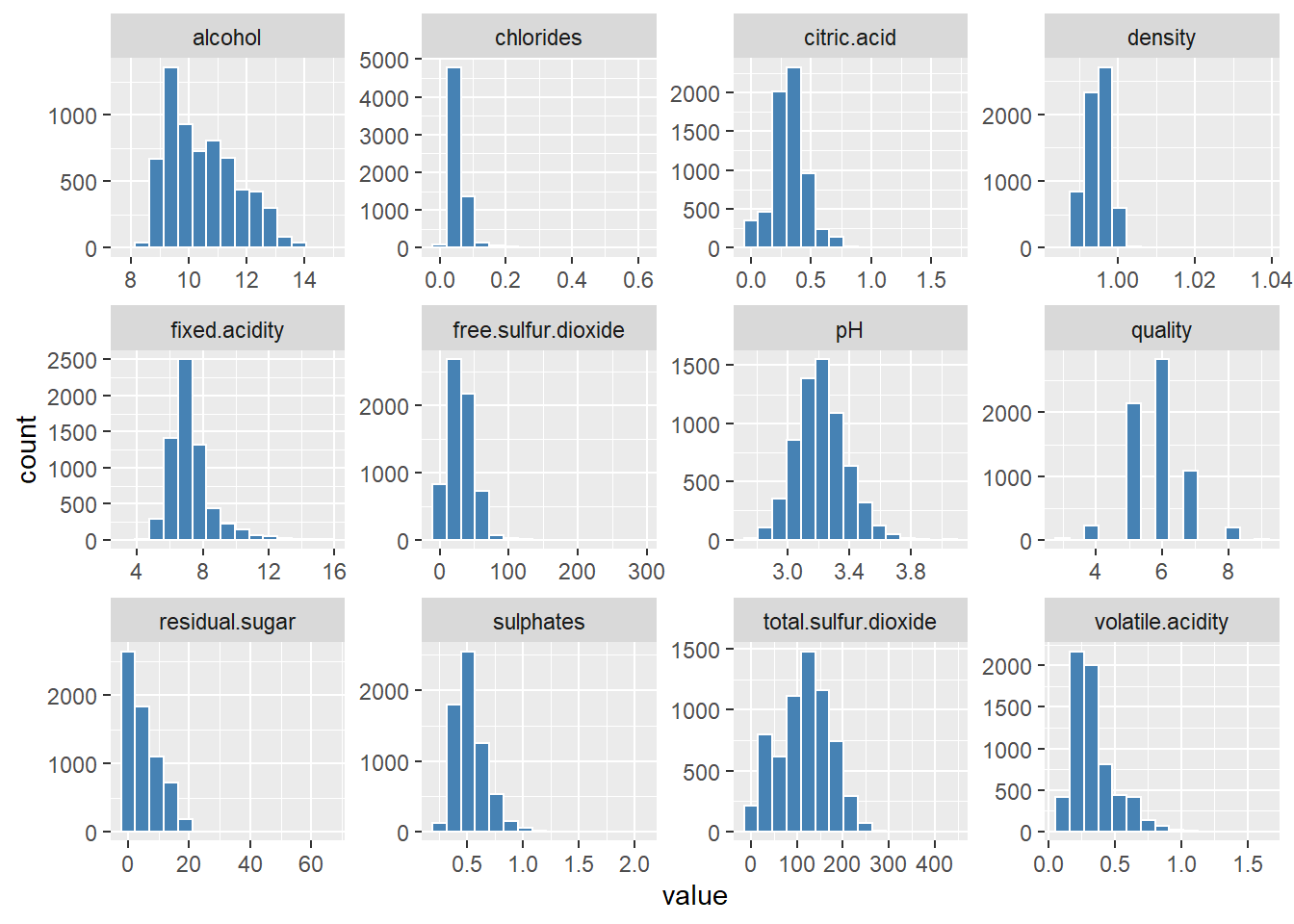
Sulphates(황산염) 변수의 히스토그램과 밀도 그래프 그리기
# 히스토그램
g1 <- wines %>%
  ggplot(aes(sulphates)) +
  geom_histogram(bins = 15, color = "white", fill = "steelblue") +
  labs(title = "Sulphates Content in Wine",
       x = "Sulphates", y = "Frequency") +
  annotate("text", x = 1.2, y = 1500, size = 5,
           label = paste("mu ==", round(mean(wines$sulphates),2)),
           parse = TRUE)

# 밀도 그래프
g2 <- wines %>%
  ggplot(aes(sulphates)) +
  geom_density(color = "steelblue", fill = "skyblue", alpha = 0.5) +
  labs(title = "Sulphates Content in Wine",
       x = "Sulphates", y = "Density")

# 히스토그램과 밀도그래프 나란히 보여주기
# gridExtra::grid.arrange
grid.arrange(g1, g2, nrow=1, ncol=2)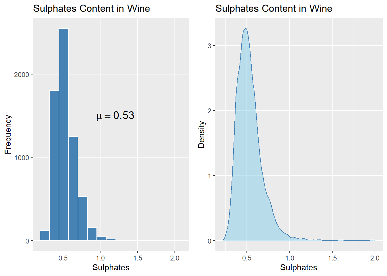
범주형 변수인 Wine Quality의 빈도 막대그래프 그리기
# Wine Quality 빈도 그래프
wines %>%
  ggplot(aes(quality)) +
  geom_bar(fill = "skyblue", alpha = 0.8) +
  labs(title = "Wine Quality Frequency", x = "Quality", y = "Frequency")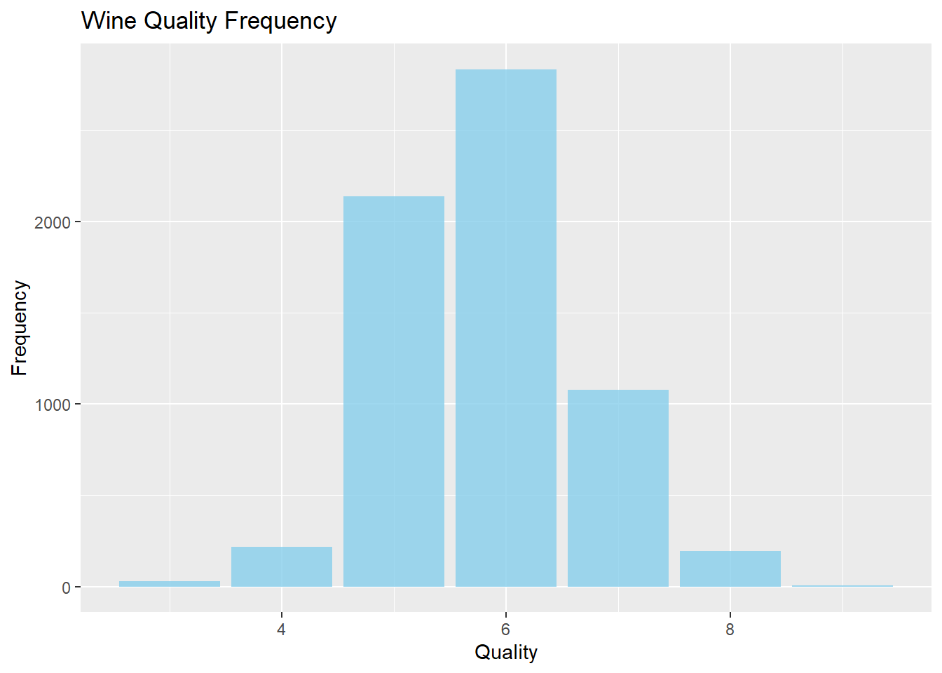
다변량 분석(Multivariate Analysis)
2차원으로 데이터 시각화하기
상관관계 히트맵 그리기
# correlation heatmap
# GGally::ggcorr
wines %>%
  keep(is.numeric) %>%
  ggcorr(label=TRUE, hjust = 0.85, size = 5) +
  labs(title = "Wine Attributes Correlation Heatmap",
       caption = "Visualizing two-dimensional data with a correlation heatmap")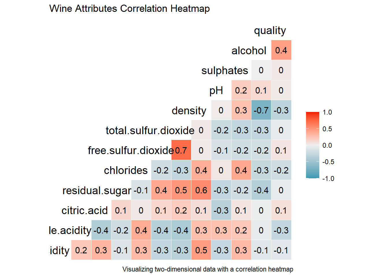
변수간 산점도와 상관계수
# pairwise scatter plots
# GGally::ggscatmat()
cols = c('density', 'residual.sugar', 'total.sulfur.dioxide', 'fixed.acidity')
wines %>%
  select(cols) %>%
  ggscatmat(alpha = 0.7)
## Note: Using an external vector in selections is ambiguous.
## i Use `all_of(cols)` instead of `cols` to silence this message.
## i See <https://tidyselect.r-lib.org/reference/faq-external-vector.html>.
## This message is displayed once per session.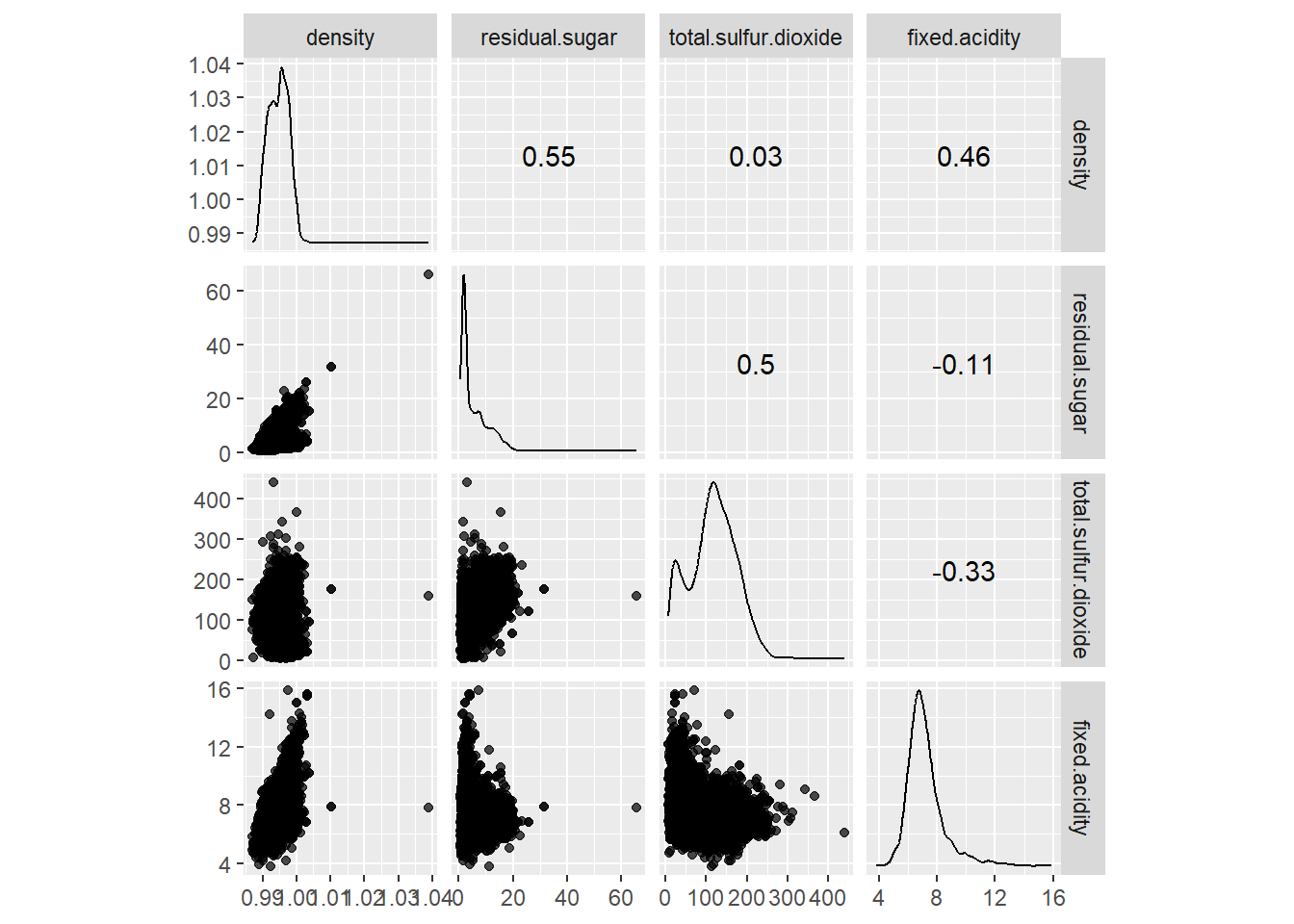
평행 좌표 그래프 (parallel coordinates) 그리기
# 이상치(outliers) 문제를 피하기 위해 데이터를 표준화(평균 0, 표준편차 1)
# psycho::standardize() 표준화 함수
cols = c('density', 'residual.sugar', 'total.sulfur.dioxide', 'fixed.acidity')
scaled_wines <- wines %>%
  select(cols) %>%
  standardize() %>%
  bind_cols(wines["wine_type"])

scaled_wines %>% head()
## density residual.sugar total.sulfur.dioxide fixed.acidity wine_type
## 1 1.5884914 2.0611957 0.7475945 -0.08894173 white
## 2 -1.2827787 -0.1772321 -0.4200955 0.21959698 white
## 3 0.1411845 0.5163653 -0.6147104 -0.39748044 white
## 4 1.2016536 1.9876324 0.8183636 -0.62888448 white
## 5 0.2278895 0.5794196 1.1722090 -0.62888448 white
## 6 -0.5891385 -0.8708294 0.1814418 0.21959698 white# GGally::ggparcoord()
scaled_wines %>%
ggparcoord(columns = 1:4, groupColumn = "wine_type") +
scale_colour_manual(values = c("#FF9999", "#FFE888")) +
theme_test()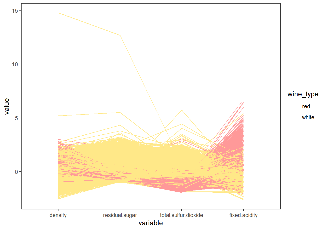
산점도와 결합 그래프 그리기
# Scatter plots and joint plots
scat_plot <- wines %>%
  ggplot(aes(x = sulphates, y = alcohol)) +
  geom_point(alpha = 0.4, color = "steelblue", size = 2) +
  labs(title = "Wine Sulphates - Alcohol Content") +
  annotate("text", x = 1.8, y = 14.5, size = 4,
           label = paste("Correlation ==",
                         round(cor(wines$sulphates, wines$alcohol), 4)),
           parse = TRUE)

ggMarginal(scat_plot, type = "histogram",
           fill = "steelblue", colour = "steelblue3")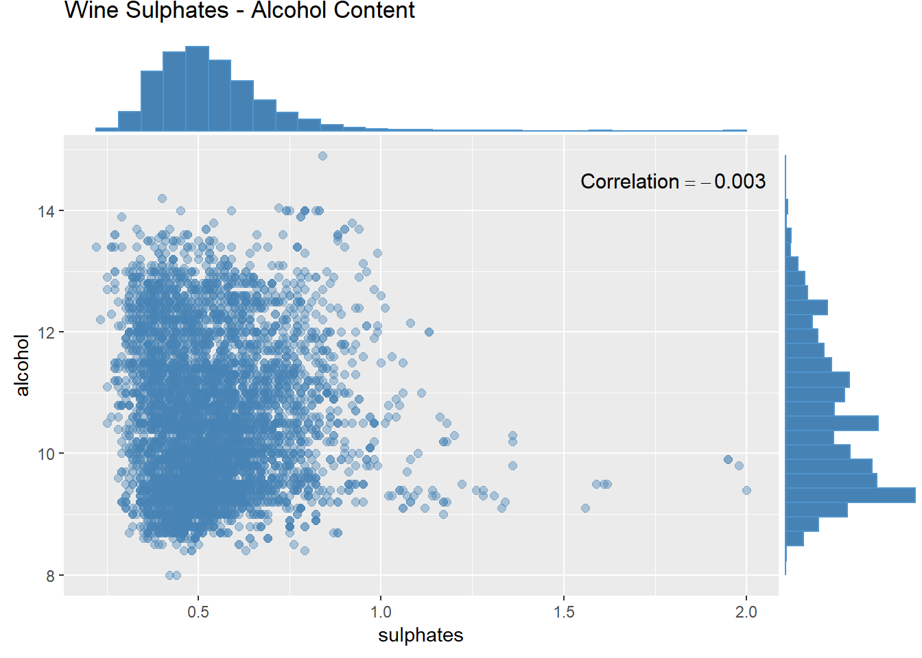
막대 그래프와 면 분할(facet)기능을 이용하여 이산형 데이터와 범주형 데이터 2차원 시각화 하기
wines %>%
  ggplot(aes(quality)) +
  geom_bar(aes(fill = wine_type), show.legend = FALSE) +
  facet_wrap(~ wine_type,
             labeller = labeller(wine_type = c(red = "Red Wine",
                                               white = "White Wine"))) +
  labs(title = "Quality by Wine Type", x = "Quality", y = "Frequency") +
  theme_test()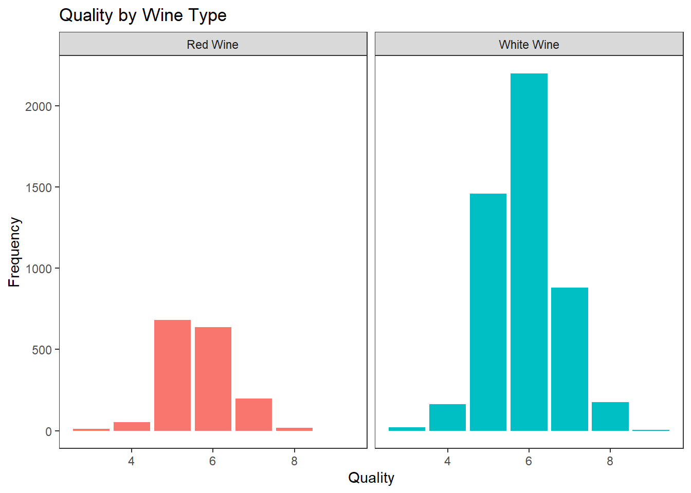
하나의 막대 그래프로 이산형 데이터와 범주형 데이터 2차원 시각화 하기
wines %>%
  ggplot(aes(quality)) +
  geom_bar(aes(fill = wine_type), position = "dodge") +
  labs(title = "Quality by Wine Type", x = "Quality", y = "Frequency") +
  theme_test()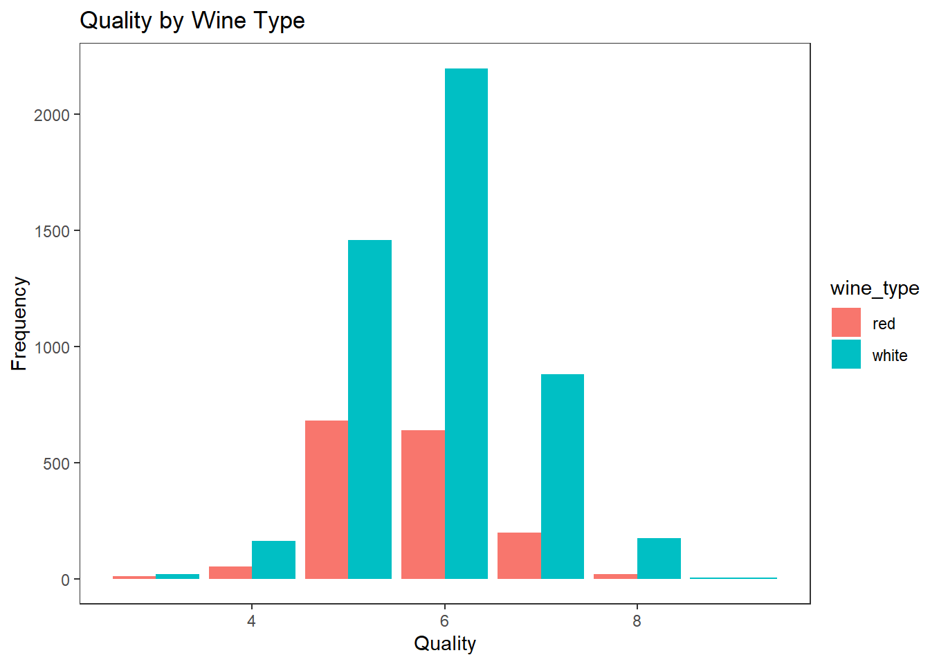
히스토그램, 밀도그래프, 면 분할 등으로 이산형 데이터와 범주형 데이터 2차원 시각화 하기
# 각각의 facet에 text를 넣기 위해 필요한 데이터 준비 (geom_text에서 사용)
data <- data.frame(x = c(1.7, 1.0),
                   y = 1100,
                   label = wines %>%
                     by(.$wine_type, FUN = function(X) mean(X$sulphates)) %>%
                     as.vector() %>% round(., 2),
                   wine_type = wines$wine_type %>% factor() %>% levels())

# 히스토그램 그리기
g1 <- wines %>%
  ggplot(aes(sulphates)) +
  geom_histogram(aes(fill = wine_type), show.legend = FALSE, bins = 15) +
  ylim(0, 1300) +
  facet_wrap(~ wine_type, scales = "free",
             labeller = labeller(wine_type = c(red = "Red Wine",
                                               white = "White Wine"))) +
  geom_text(data = data, aes(x, y, label=paste("mu==", data$label)), parse = TRUE) +
  labs(title = "Sulphates Content in Wine", x = "Sulphates", y = "Frequency") +
  theme_test()

# 밀도 그래프 density plot 그리기
g2 <- wines %>%
  ggplot(aes(sulphates)) +
  geom_density(aes(fill = wine_type), show.legend = FALSE, alpha = 0.7) +
  facet_wrap(~ wine_type, scales = "free",
             labeller = labeller(wine_type = c(red = "Red Wine",
                                               white = "White Wine"))) +
  labs(title = "", x = "Sulphates", y = "Density") +
  theme_test()

# 히스토그램과 밀도그래프 나란히 보여주기
grid.arrange(g1, g2, nrow=2, ncol=1)
## Warning: Use of `data$label` is discouraged. Use `label` instead.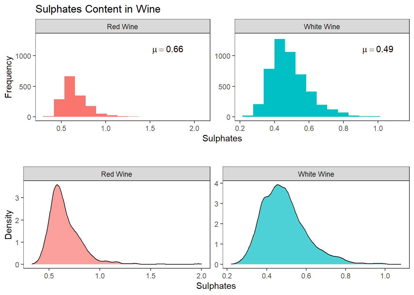
다중 밀도그래프와 히스토그램 선 그래프 그리기
# 밀도 그래프
wines %>%
  ggplot(aes(sulphates)) +
  geom_density(aes(fill = wine_type), alpha = 0.5) +
  labs(title = "Sulphates Content in Wine", x = "Sulphates", y = "Density") +
  theme_test()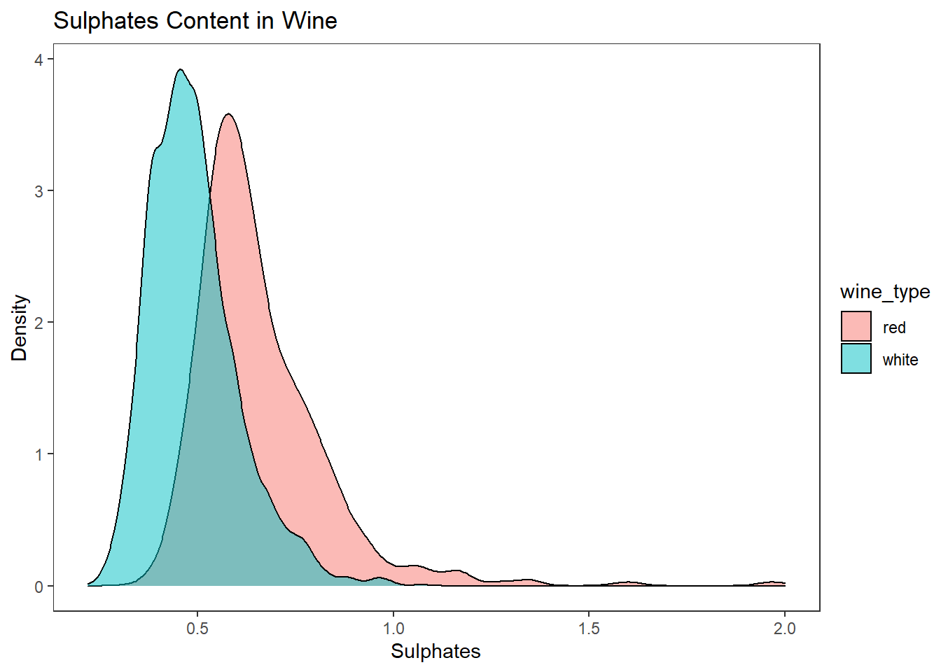
# 히스토그램 선 그래프
wines %>%
  ggplot(aes(sulphates)) +
  geom_freqpoly(aes(color = wine_type), bins = 15, size = 2) +
  labs(title = "Sulphates Content in Wine", x = "Sulphates", y = "Frequency") +
  theme_test()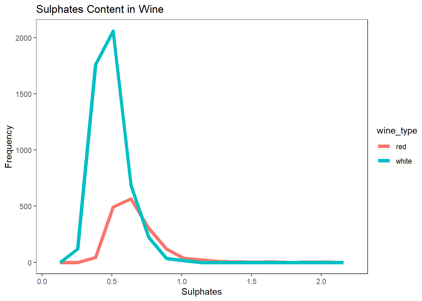
상자 수염 그림(Box Plots)으로 이차원 데이터 시각화 하기
# Box Plots of two-dimensional mixed attributes
wines %>%
  ggplot(aes(factor(quality), alcohol)) +
  geom_boxplot(aes(fill = factor(quality)), show.legend = FALSE) +
  labs(title = "Wine Quality - Alcohol Content",
       x = "Wine Quality", y = "Wine Alcohol %") +
  theme_test()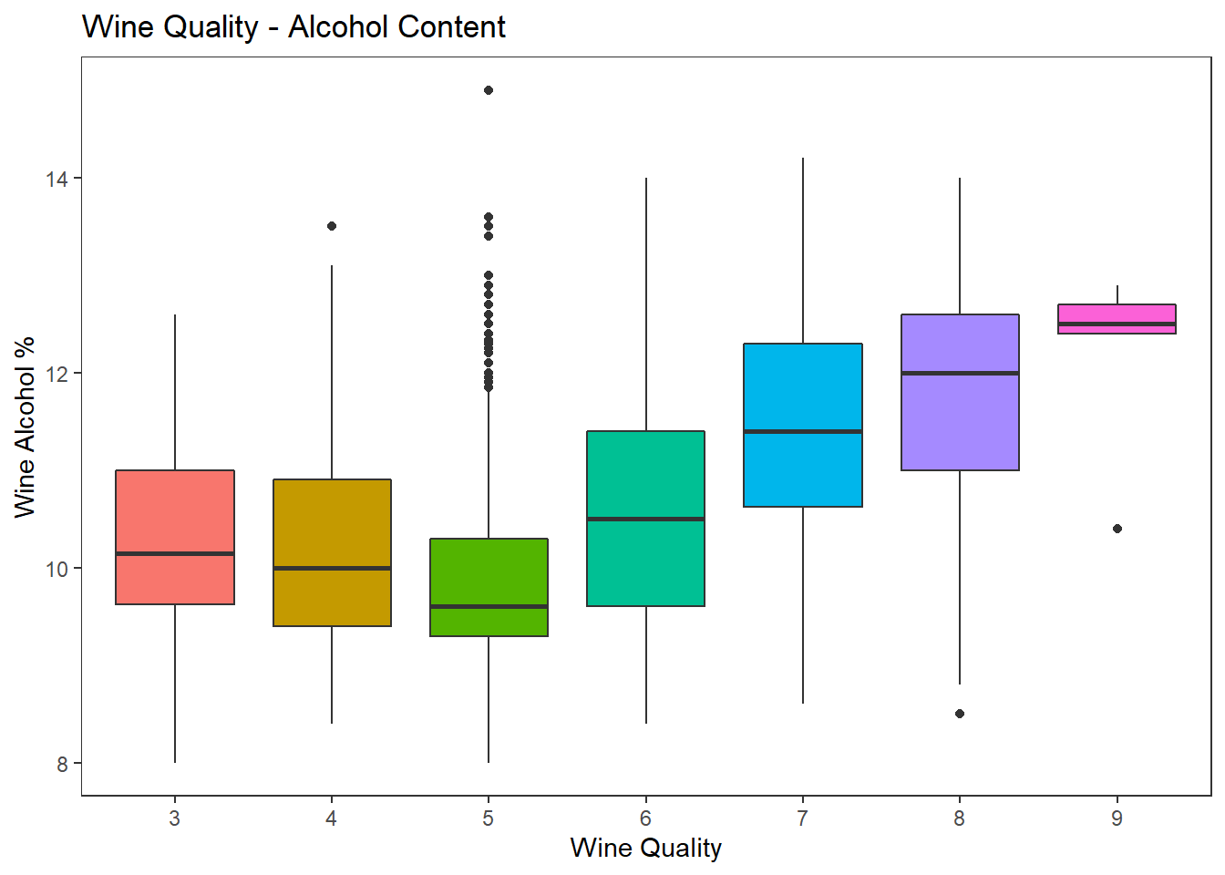
바이올린 그래프로 이차원 데이터 시각화 하기
# Violin Plots
wines %>%
  ggplot(aes(factor(quality), sulphates)) +
  geom_violin(aes(fill = factor(quality)), show.legend = FALSE) +
  geom_boxplot(width=0.08) +
  labs(title = "Wine Quality - Sulphates Content",
       x = "Wine Quality", y = "Wine Sulphates") +
  theme_test()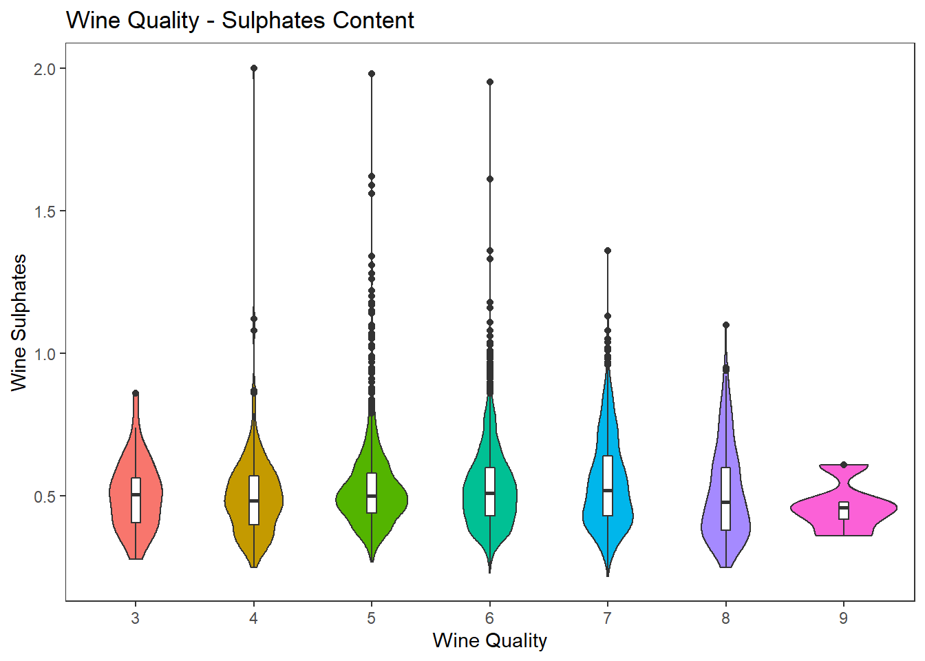
3차원으로 데이터 시각화하기
산점도와 색으로 3차원 데이터 시각화 하기
# Visualizing three-dimensional data with scatter plots and hue (color)
cols = c('density', 'residual.sugar', 'total.sulfur.dioxide', 'fixed.acidity', 'wine_type')
wines %>%
  select(cols) %>%
  ggscatmat(columns = 1:4, color = "wine_type") +
  labs(title = "Wine Attributes Pairwise Plots")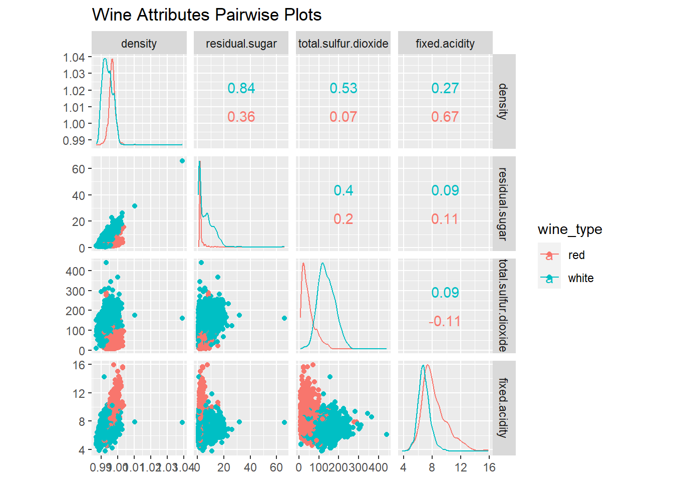
3차원 그림으로 양적 데이터 시각화 하기
# plotly::plot_ly
wines %>%
  plot_ly(x = ~residual.sugar, y = ~fixed.acidity, z = ~alcohol,
          type = "scatter3d", mode = "markers",
          marker = list(size = 5, color = 'skyblue',
                        line = list(color = 'steelblue', width = 1))) %>%
  layout(scene = list(xaxis = list(title = 'Residual Sugar'),
                      yaxis = list(title = 'Fixed Acidity'),
                      zaxis = list(title = 'Alcohol')))
크기를 추가하여 3차원 데이터 시각화 하기
# using size for the 3rd dimension
wines %>%
  ggplot(aes(x = fixed.acidity, y = alcohol)) +
  geom_point(aes(size = residual.sugar), color = "steelblue", alpha = 0.5) +
  theme_test()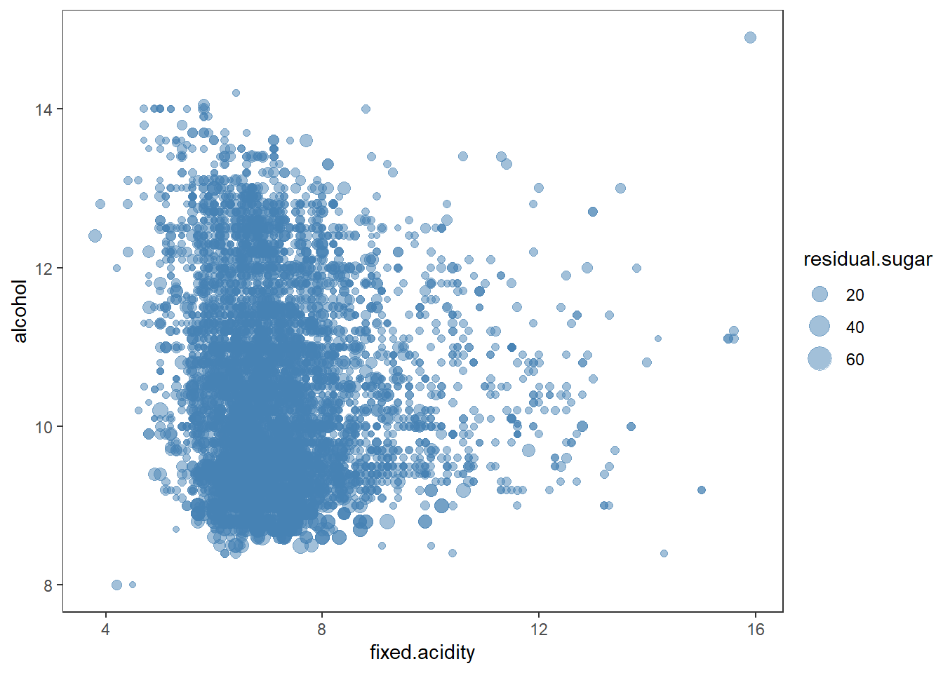
색을 추가하여 3차원 데이터 시각화 하기
# using color for the 3rd dimension
wines %>%
  ggplot(aes(x = fixed.acidity, y = alcohol)) +
  geom_point(aes(color = residual.sugar), size = 2, alpha = 0.5) +
  theme_test()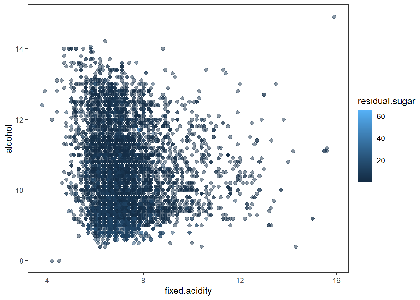
색과 면 분할을 이용하여 3차원 데이터 시각화 하기
# using color and facets
# residual sugar와 alcohol의 level 변수 추가
# 사분위수를 추출하여 사분위별로 레벨값을 부여한 변수 생성
wines <- wines %>%
  mutate(res_sugar_labels = case_when(residual.sugar < quantile(residual.sugar, probs = 0.25) ~ 0,
                                      residual.sugar < quantile(residual.sugar, probs = 0.5) ~ 25,
                                      residual.sugar < quantile(residual.sugar, probs = 0.75) ~ 50,
                                      TRUE ~ 75),
         alcohol_levels = case_when(alcohol < quantile(alcohol, probs = 0.25) ~ 0,
                                    alcohol < quantile(alcohol, probs = 0.5) ~ 25,
                                    alcohol < quantile(alcohol, probs = 0.75) ~ 50,
                                    TRUE ~ 75)) %>%
  mutate(res_sugar_labels = factor(res_sugar_labels),
         alcohol_levels = factor(alcohol_levels))

wines %>%
  ggplot(aes(x = fixed.acidity, y = alcohol)) +
  geom_point(aes(color = alcohol_levels), size = 2) +
  facet_wrap(vars(res_sugar_labels), labeller = "label_both") +
  theme_test()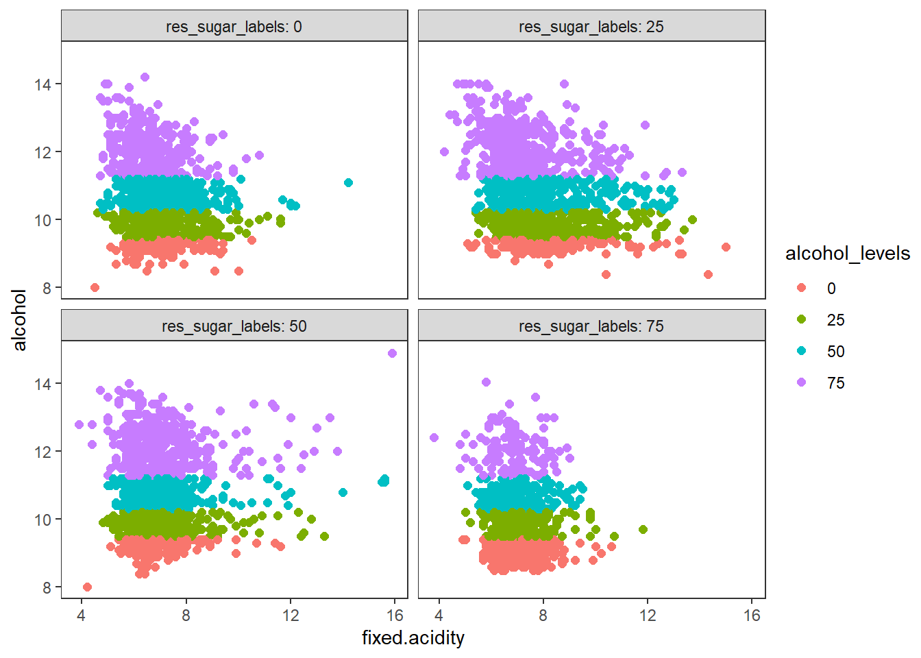
막대그래프, 색, 면 분할을 이용하여 3차원 데이터 시각화 하기
# using bar plots, hue and facets
wines %>%
  ggplot(aes(quality)) +
  geom_bar(aes(fill = wine_type), position = "dodge") +
  facet_wrap(vars(quality_label), labeller = "label_both") +
  theme_test()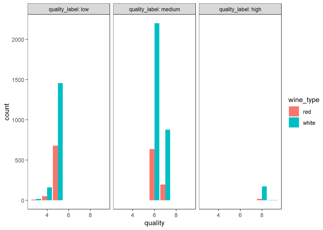
색과 산점도를 이용하여 3차원 데이터 시각화 하기
# using scatter plots and hue
wines %>%
  ggplot(aes(x = sulphates, y = alcohol)) +
  geom_point(shape = 21, aes(fill = wine_type), size = 3) +
  geom_smooth(aes(color = wine_type), method = "lm", fullrange=TRUE) +
  theme(legend.position = c(.92, .85),
        panel.background = element_rect(fill = "white", colour = "grey10"))
## `geom_smooth()` using formula 'y ~ x'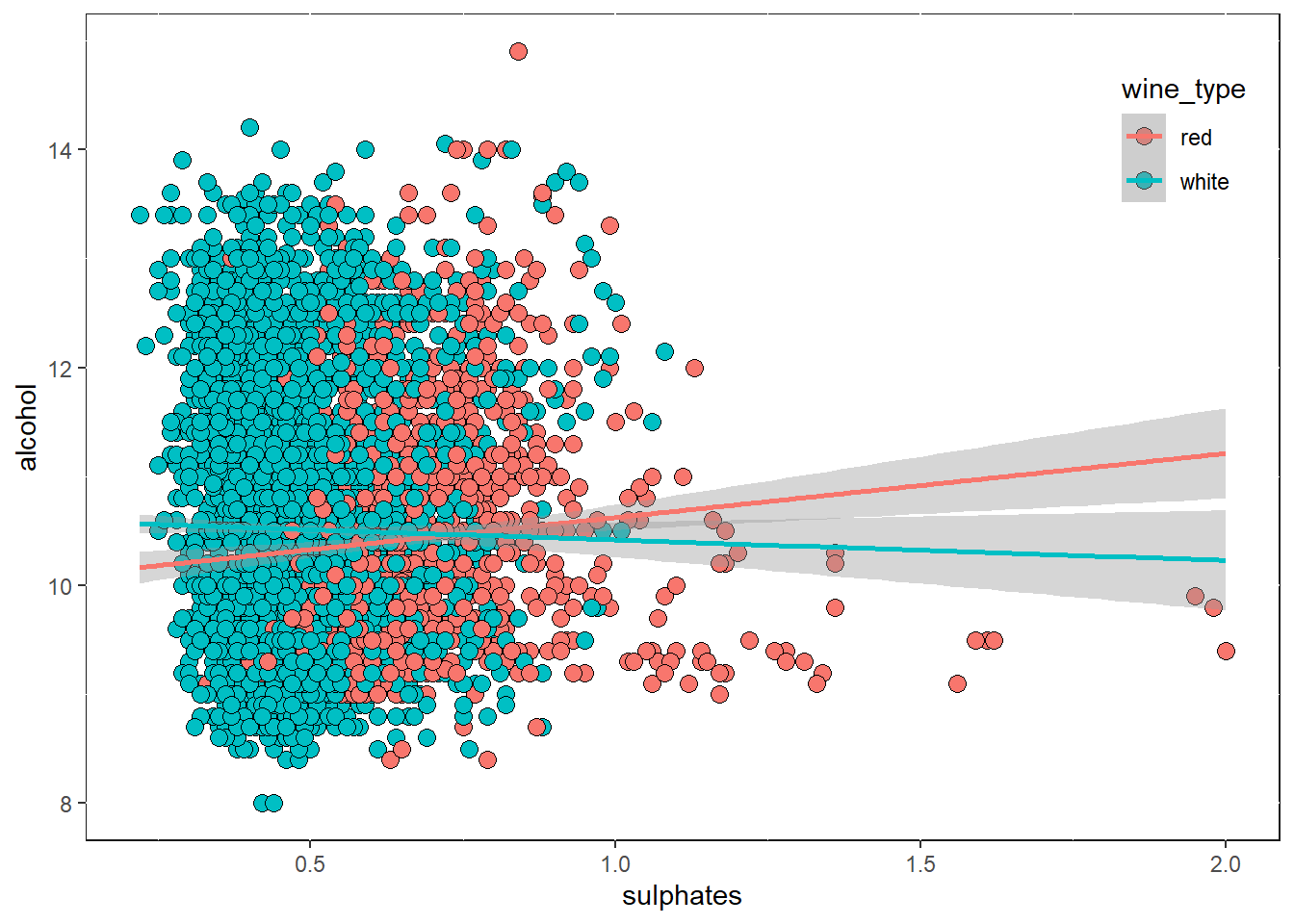
색과 커멀 밀도 그래프를 이용하여 3차원 데이터 시각화 하기
# using kernel density plots and hue
wines %>%
  ggplot(aes(x = sulphates, y = alcohol)) +
  stat_density_2d(aes(fill = ..level.., color = wine_type),
                  geom="polygon", alpha = 0.3, contour = TRUE, size = 1) +
  scale_fill_distiller(palette="Reds", direction=1) +
  theme_test()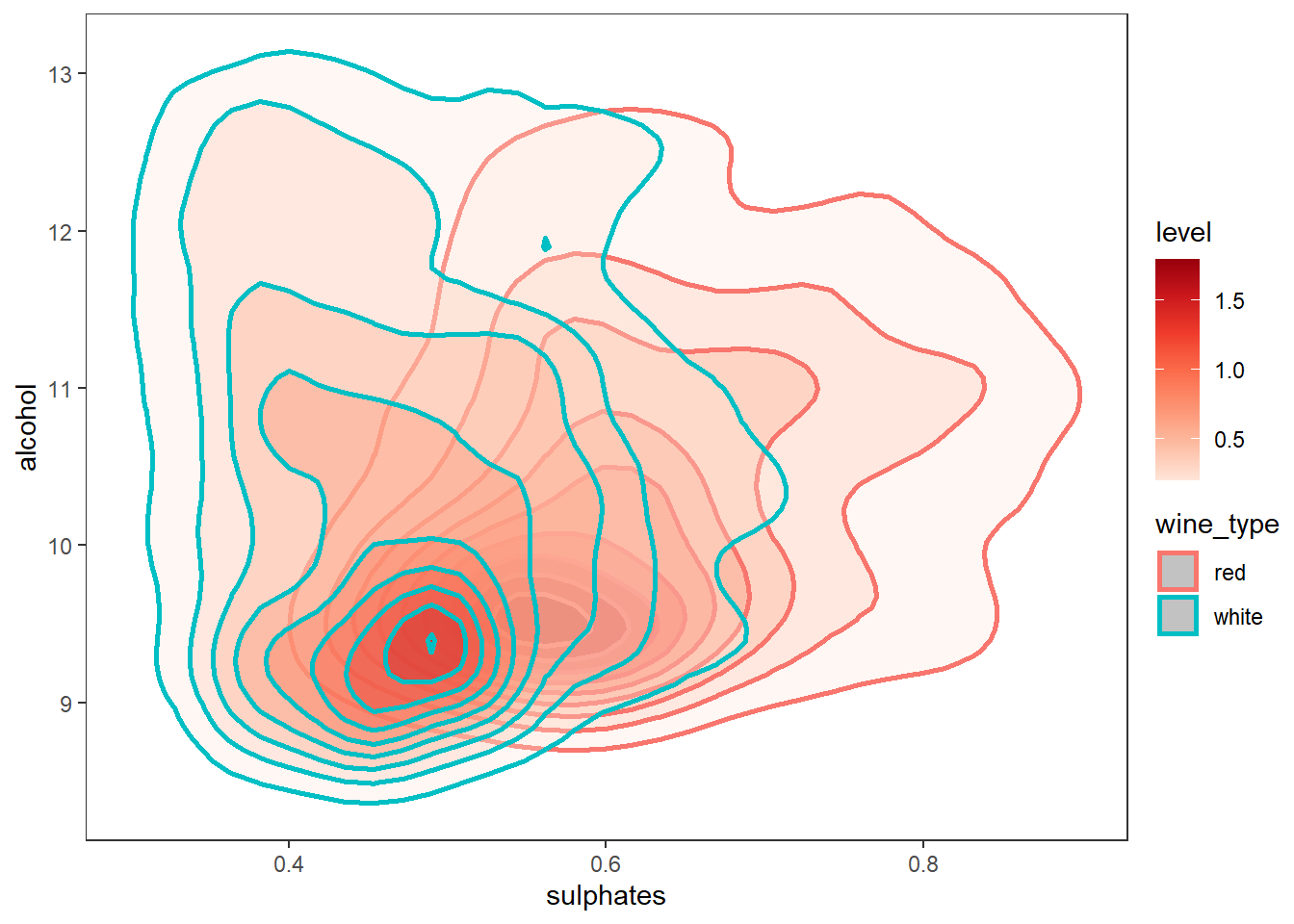
색과 바이올린 그래프를 이용하여 3차원 데이터 시각화 하기
# using violin plots and hue and axes
wines$quality <- factor(wines$quality)

g1 <- wines %>%
  ggplot(aes(quality, volatile.acidity)) +
  geom_violin(aes(fill = quality), trim = FALSE, show.legend = FALSE,
              draw_quantiles = c(0.25, 0.5, 0.75)) +
  theme_test()

g2 <- wines %>%
  ggplot(aes(quality, volatile.acidity)) +
  geom_violin(aes(fill = wine_type), trim = FALSE, alpha = 0.5,
              position = position_dodge(width = 0.3),
              draw_quantiles = c(0.25, 0.5, 0.75)) +
  theme_test()

# grid::textGrob, gridExtra::grid.arrange
grid.arrange(g1, g2, nrow=1, ncol=2,
             top = grid.text("Wine Type - Quality - Acidity",
                             gp = gpar(fontsize = 16, fontface = "bold")))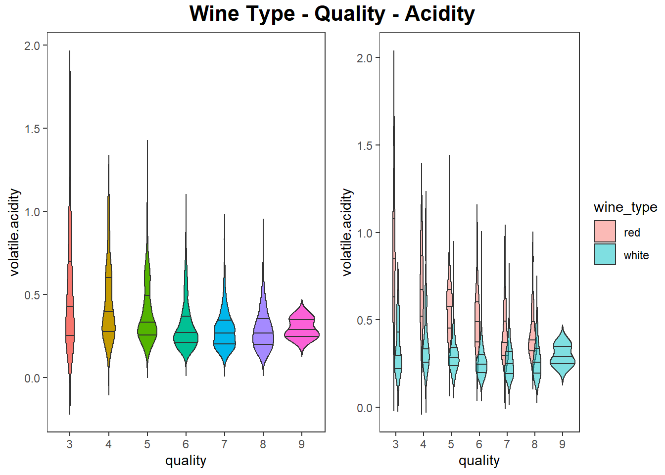
색과 상자그림으로 3차원 데이터 시각화 하기
# using box plots, hue and axes
g1 <- wines %>%
  ggplot(aes(quality, alcohol)) +
  geom_boxplot(aes(fill = wine_type), show.legend = FALSE) +
  labs(x = "Wine Quality", y = "Wine Alcohol %") +
  theme_test()

g2 <- wines %>%
  ggplot(aes(quality_label, alcohol)) +
  geom_boxplot(aes(fill = wine_type)) +
  labs(x = "Wine Quality Class", y = "Wine Alcohol %") +
  theme_test()

# grid::textGrob,  gridExtra::grid.arrange
grid.arrange(g1, g2, nrow=1, ncol=2,
             top = grid.text("Wine Type - Quality - Alcohol Content",
                             gp = gpar(fontsize = 16, fontface = "bold")))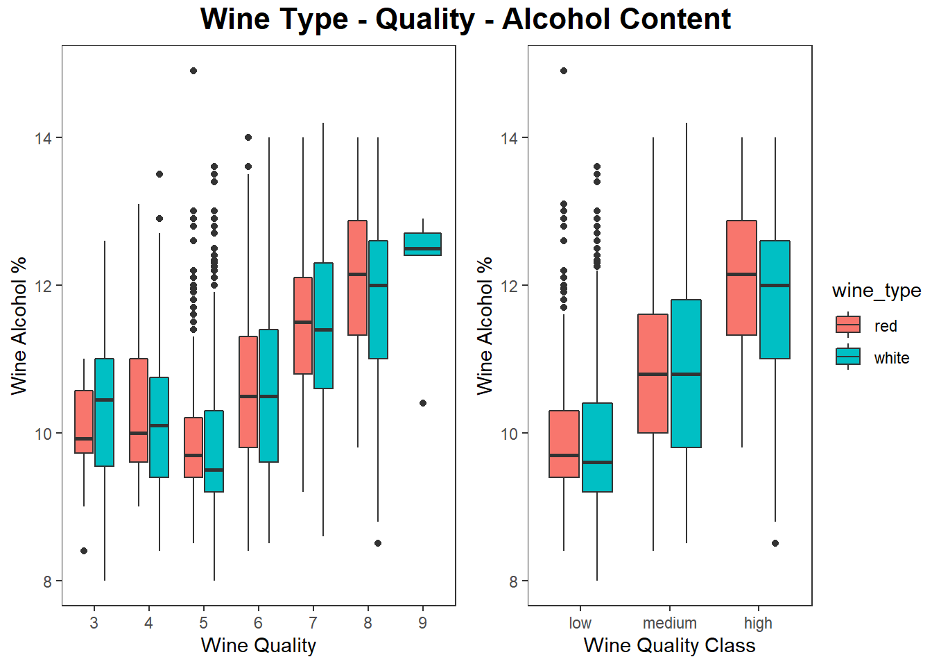
4차원으로 데이터 시각화하기
3차원 그림과 색을 이용하여 4차원 데이터 시각화 하기
# using depth, hue, x-asix, y-asix
# plotly::plot_ly
wines %>%
  plot_ly(x = ~alcohol, y = ~residual.sugar, z = ~fixed.acidity,
          type = "scatter3d", mode = "markers",
          marker = list(size = 5, color = ~wine_type,
                        line = list(color = 'steelblue', width = 1)))
버블차트에 색조와 크기를 적용하여 4차원 데이터 시각화
# using bubble plots, hue and size
wines %>%
  ggplot(aes(fixed.acidity, alcohol)) +
  geom_point(shape = 21, alpha = 0.2, stroke = 1,
             aes(fill = wine_type, size = residual.sugar, color = wine_type)) +
  scale_fill_manual(values = c("red", "gold")) +
  scale_color_manual(values = c("red4", "gold4")) +
  scale_size(range = c(1, 15)) +
  labs(title = "Wine Alcohol Content - Fixed Acidity - Residual Sugar - Type") +
  theme_test()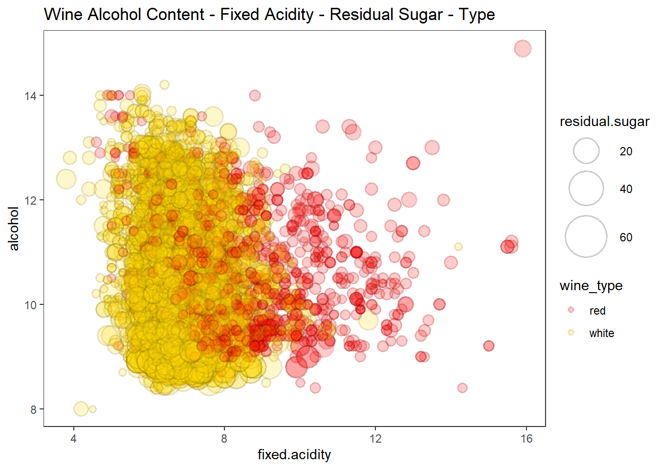
산점도, 색조, 면분할을 이용하여 4차원 데이터 시각화 하기
# scatter plots, hue and facets
wines %>%
  ggplot(aes(fixed.acidity, alcohol)) +
  geom_point(shape = 21, alpha = 0.5, stroke = 1, size = 3,
             aes(fill = wine_type, color = wine_type)) +
  scale_fill_manual(values = c("red", "gold")) +
  scale_color_manual(values = c("red4", "gold4")) +
  facet_wrap(vars(res_sugar_labels), labeller = "label_both") +
  theme_test()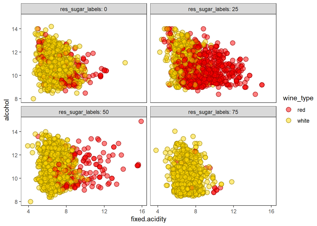
산점도, 색조, 면분할을 이용하여 4차원 데이터 시각화 하기
# scatter plots, hue and facets
wines %>%
  ggplot(aes(volatile.acidity, alcohol)) +
  geom_point(shape = 21, alpha = 0.8, stroke = 1, size = 3, color = "gray10",
             aes(fill = quality_label)) +
  scale_fill_manual(values = c("skyblue", "dodgerblue3", "blue4")) +
  facet_wrap(vars(wine_type), labeller = "label_both") +
  labs(title = "Wine Type - Alcohol - Quality - Acidity") +
  theme_test()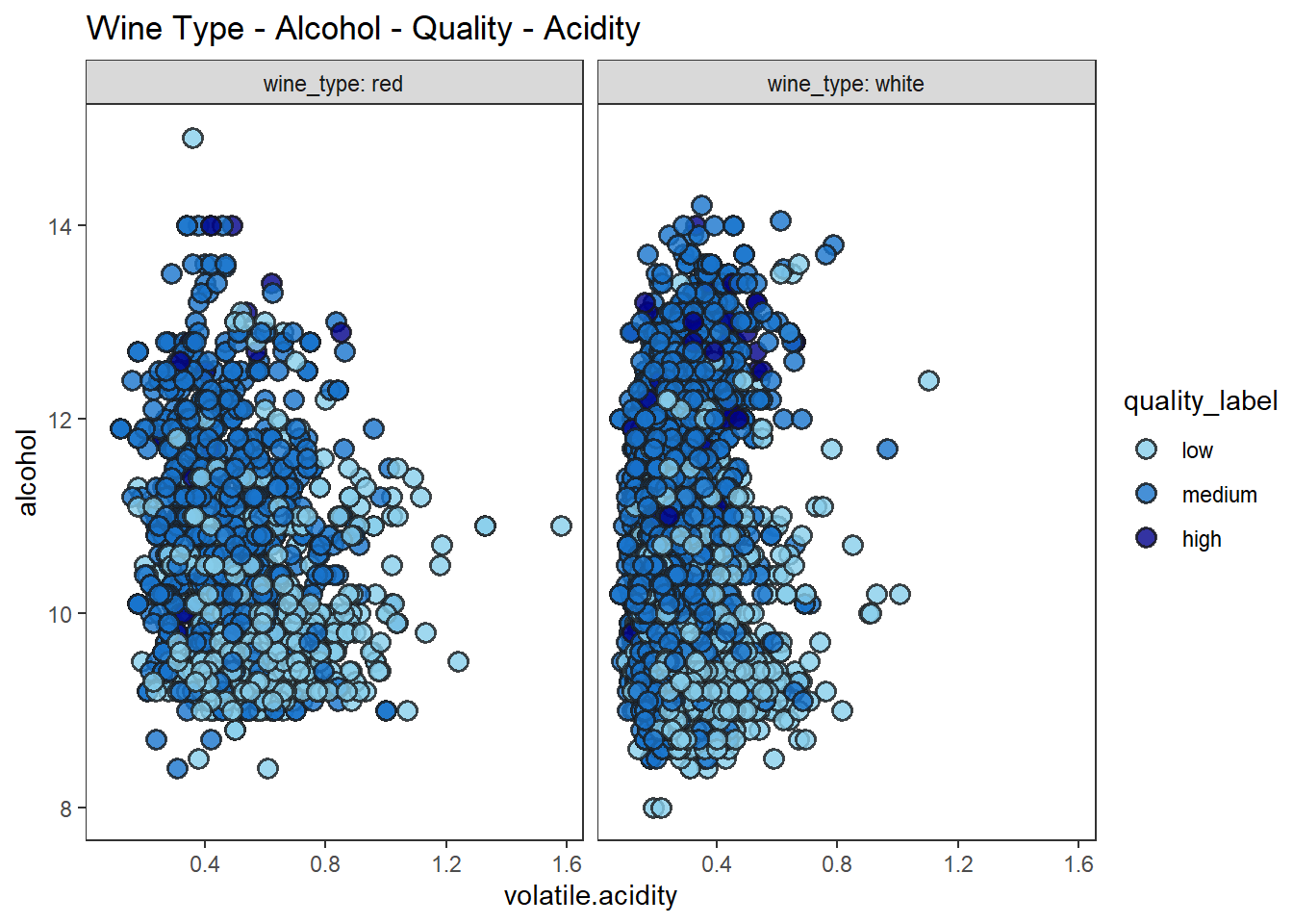
산점도, 색조, 면분할을 이용하여 4차원 데이터 시각화 하기
wines %>%
  ggplot(aes(volatile.acidity, total.sulfur.dioxide)) +
  geom_point(shape = 21, stroke = 1, size = 4, color = "gray10",
             aes(fill = quality_label)) +
  scale_fill_manual(values = c("palegreen", "green3", "darkgreen")) +
  facet_wrap(vars(wine_type), labeller = "label_both") +
  labs(title = "Wine Type - Alcohol - Quality - Acidity") +
  theme_test()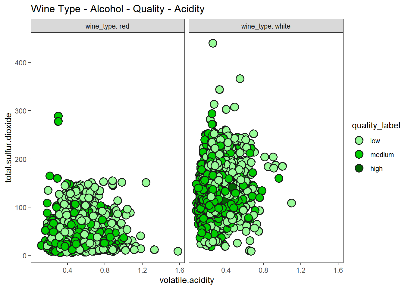
5차원으로 데이터 시각화하기
시각적 오해, 시각적 난이도 증가 등 불편함이 크기 때문에 3D 차트는 가급적 쓰지 않은 것이 좋다고 생각한다. 가급적 이차원 차트에 색, 크기, 면분할 등을 이용하여 3차원 이상의 데이터를 시각화하는 것이 더 도움이 된다고 본다.
산점도, 색조, 이중 면분할을 이용하여 5차원 데이터 시각화 하기
# total_so2_levels 변수 생성
wines <- wines %>%
  mutate(total_so2_levels = case_when(total.sulfur.dioxide < quantile(total.sulfur.dioxide,
                                                                      probs = 0.25) ~ 0,
                                      total.sulfur.dioxide < quantile(total.sulfur.dioxide,
                                                                      probs = 0.5) ~ 25,
                                      total.sulfur.dioxide < quantile(total.sulfur.dioxide,
                                                                      probs = 0.75) ~ 50,
                                      TRUE ~ 75)) %>%
  mutate(total_so2_levels = factor(total_so2_levels))

# using scatter plots, hue, 2 facets
wines %>%
  ggplot(aes(residual.sugar, alcohol)) +
  geom_point(aes(fill = quality_label), shape = 21, size = 3) +
  facet_grid(row = vars(wine_type), col = vars(total_so2_levels),
             labeller = "label_both") +
  theme_test() +
  labs(title = "Wine Type - Sulfur Dioxide - Residual Sugar - Alcohol - Quality Class")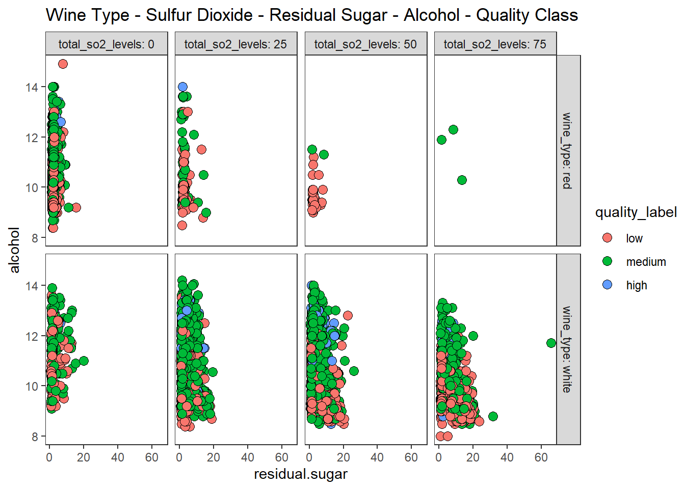
6차원으로 데이터 시각화하기
산점도, 색조, 크기, 이중 면분할을 이용하여 6차원 데이터 시각화 하기
wines %>%
  ggplot(aes(residual.sugar, alcohol)) +
  geom_point(aes(fill = quality_label, size = fixed.acidity), shape = 21) +
  facet_grid(row = vars(wine_type), col = vars(quality),
             labeller = "label_both") +
  theme_test() +
  labs(title = "Wine Type - Quality Rating - Residual Sugar - Alcohol -  Quality Class - Sulfur Dioxide")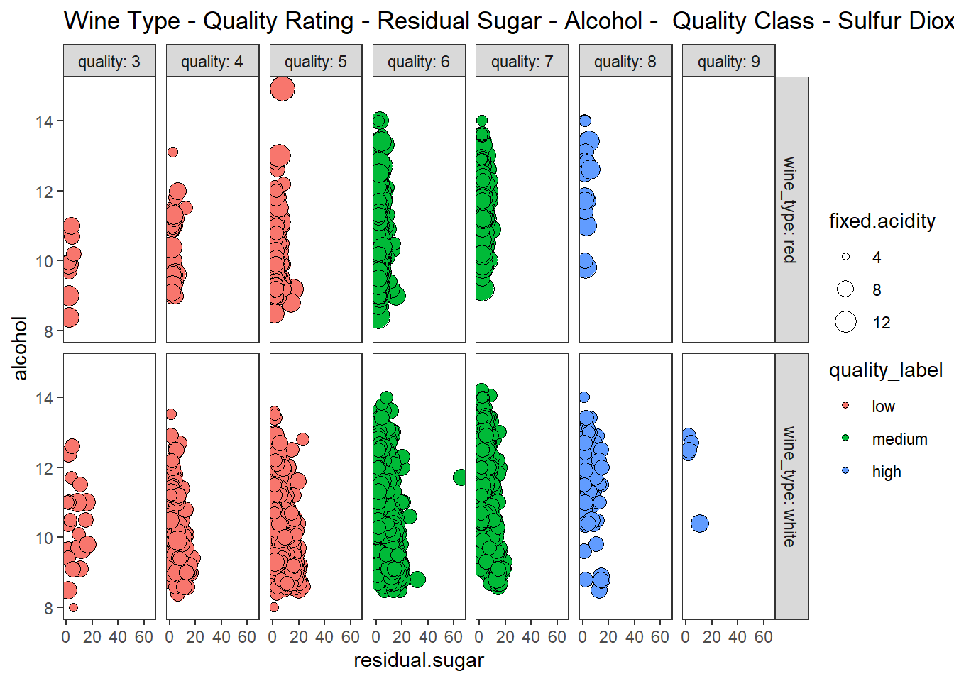
비구조화된 데이터 시각화하기 - 텍스트, 이미지, 오디오
텍스트 데이터 시각화 하기
킹제임스 성경 각 줄의 문자열 길이와 단어 개수를 시각화 하기
# 구텐베르그 사이트에서 도서 파일 불러오기
library(gutenbergr, quietly = TRUE)
kjv_meta <- gutenberg_works(title == "The King James Version of the Bible")
bible <- gutenberg_download(kjv_meta$gutenberg_id)
## Determining mirror for Project Gutenberg from http://www.gutenberg.org/robot/harvest## Using mirror http://aleph.gutenberg.orghead(bible)## # A tibble: 6 x 2
## gutenberg_id text
## <int> <chr>
## 1 10 The Old Testament of the King James Version of the Bible
## 2 10 The First Book of Moses: Called Genesis
## 3 10 The Second Book of Moses: Called Exodus
## 4 10 The Third Book of Moses: Called Leviticus
## 5 10 The Fourth Book of Moses: Called Numbers
## 6 10 The Fifth Book of Moses: Called Deuteronomy# text 열만 남기고, 빈 줄울 삭제
bible <- bible %>%
select(text) %>%
filter(!text == "")
# 각 줄의 문자열 길이 구하기
bible$line_length <- nchar(bible$text)
# 각 줄의 문자열 길이 그래프
bible %>%
ggplot(aes(line_length)) +
geom_density(fill = "red", alpha = 0.5, color = "red", size = 1) +
theme_test()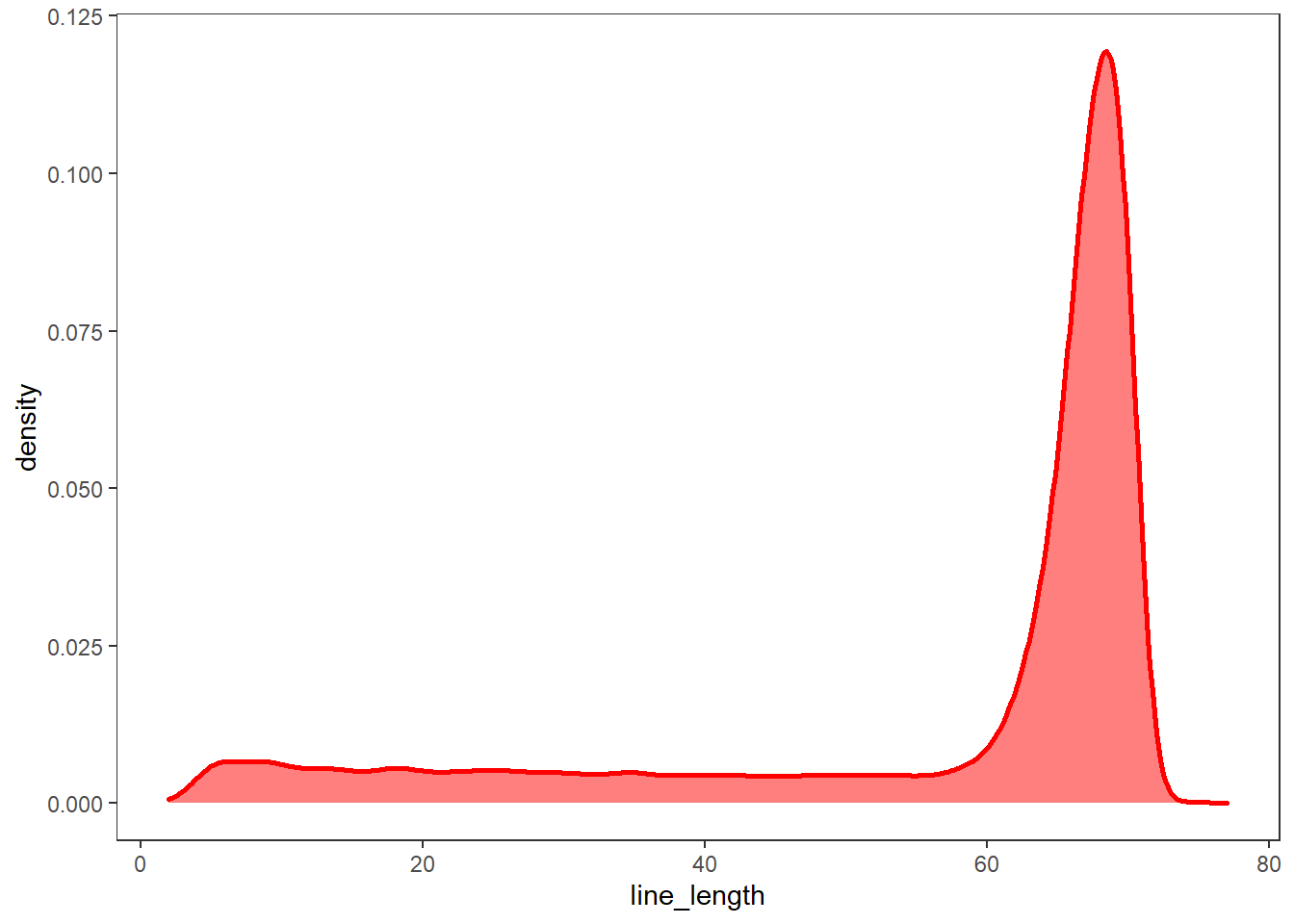
# 각 줄의 단어 개수 세기
# tokenizers::tokenize_words
words <- tokenize_words(bible$text)
bible$word_length <- words %>% map_int(length)

# 각 줄의 단어 개수 그래프
bible %>%
  ggplot(aes(word_length)) +
  geom_density(fill = "goldenrod1", alpha = 0.5,
               color = "goldenrod1", size = 1) +
  theme_test()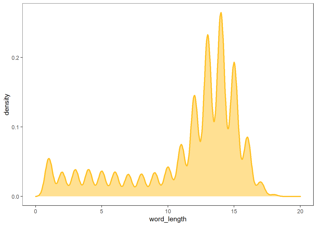
이미지 데이터 시각화 하기
개와 고양이 그림을 불러와 화면에 출력하기
# library(imager)
cat <- load.image("cat.jpg")
dog <- load.image("dog.jpg")

opar <- par(mfrow = c(1, 2))
plot(cat, main="Cat")
plot(dog, main="Dog")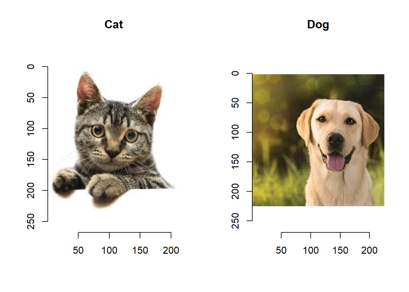
par(opar)Red, Green, Blue 채널별로 시각화 하기
opar <- par(mfrow = c(1, 3))
cscale <- function(v) rgb(v,0,0)   # Red
grayscale(cat) %>% plot(colourscale = cscale, rescale = FALSE, main = "Red")
cscale <- function(v) rgb(0,v,0)   # Green
grayscale(cat) %>% plot(colourscale = cscale, rescale = FALSE, main = "Green")
cscale <- function(v) rgb(0,0,v)   # Blue
grayscale(cat) %>% plot(colourscale = cscale, rescale = FALSE, main = "Blue")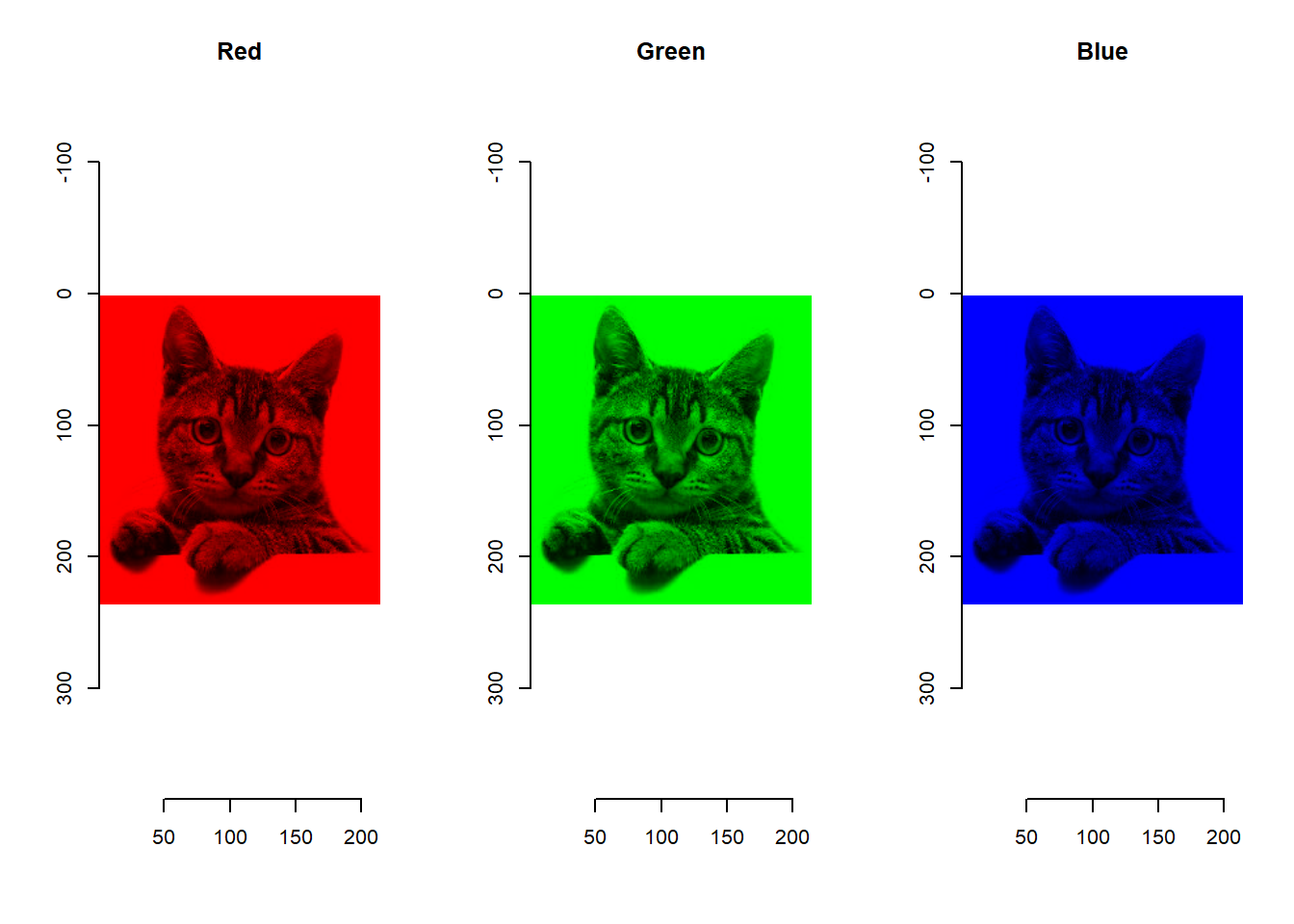
par(opar)이미지 픽셀값을 이용하여 image intensity distribution 시각화 하기
opar <- par(mfrow = c(2, 2), mar = c(3,3,3,3))
grayscale(cat) %>% plot(main="Cat")
grayscale(dog) %>% plot(main="Dog")
grayscale(cat) %>% hist(col = "skyblue", main="Histogram of Cat")
grayscale(dog) %>% hist(col = "skyblue", main="Histogram of Dog")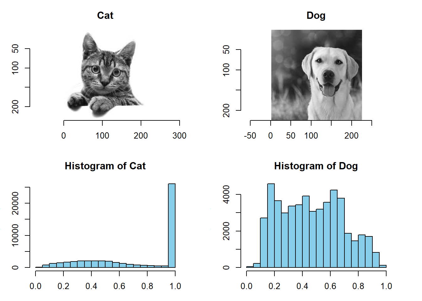
par(opar)이미지 가장자리 나타내기
cannyEdges(cat, alpha = 0.7, sigma = 3) %>% plot()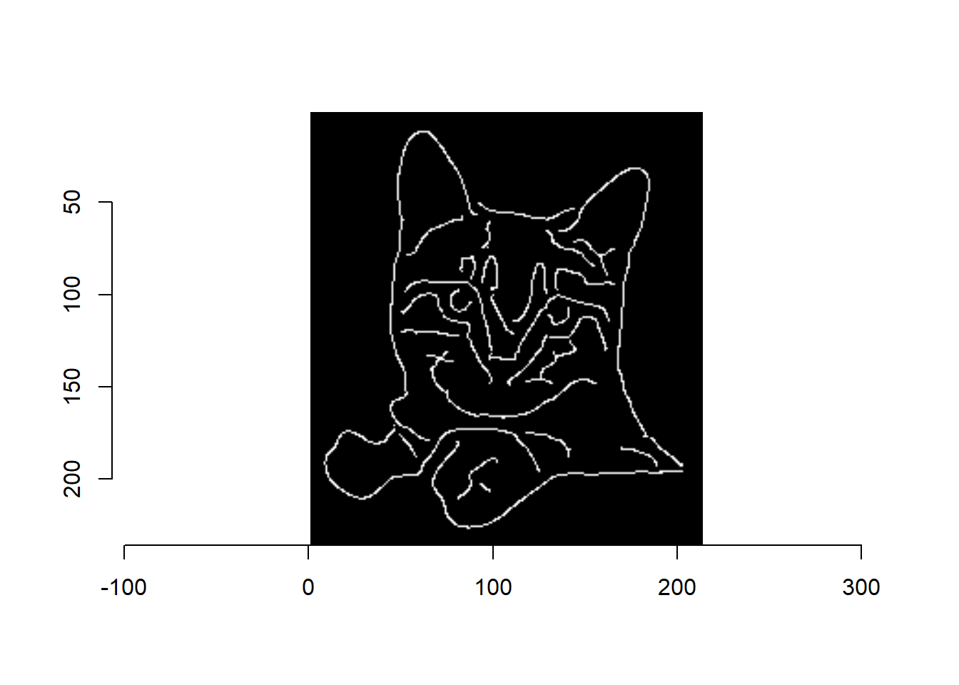
gr <- imgradient(cat, "xy")
plot(gr, layout="row")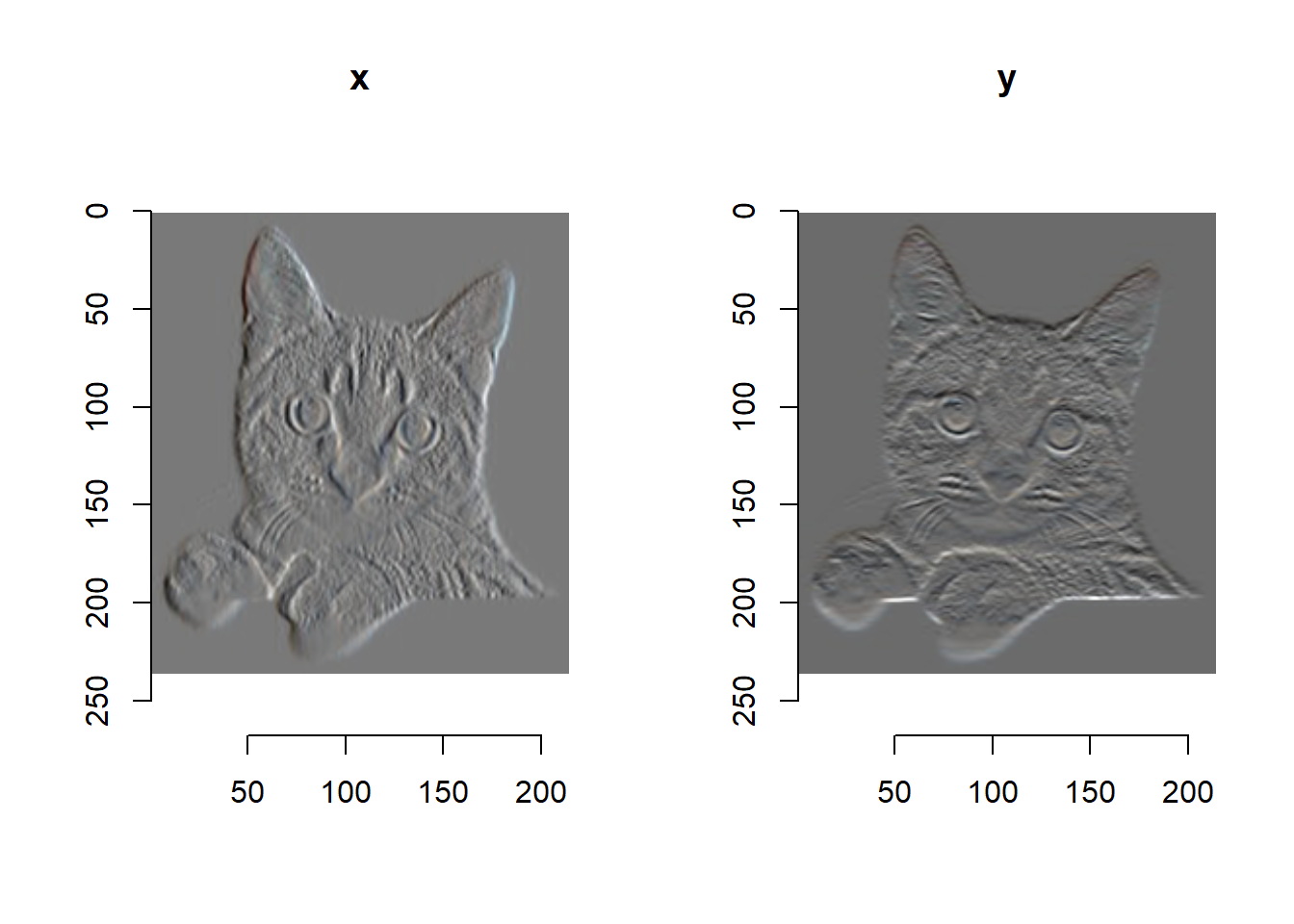
오디오 데이터 시각화 하기
오디오 패키지 불러오기 및 패키지 내장 사운드 불러오기
# load library
library(tuneR)
library(seewave)
# load sound data - Data sets in package ‘seewave’
data(orni) # Song of the cicada Cicada orni
data(tico) # Song of the bird Zonotrichia capensis
## 음악(소리) 듣기
# play(orni)
# play(tico)오디오 파형 진폭 시각화 하기
# a time wave as an oscillogram in a single or multi-frame plot
opar <- par(mfrow = c(1, 2))
oscillo(orni, title = "orni")
oscillo(tico, title = "tico")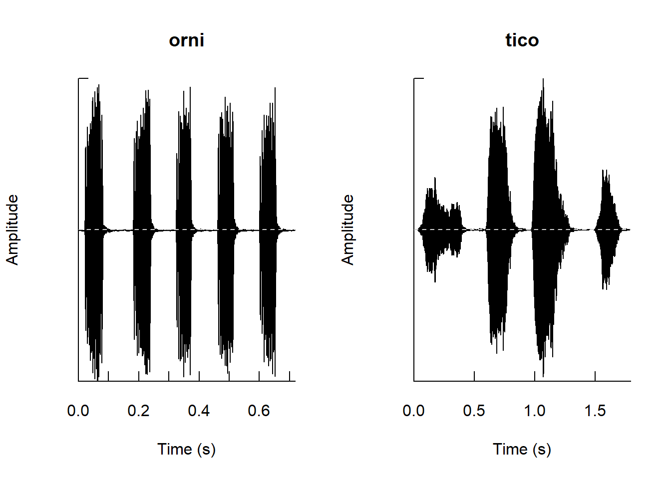
par(opar)오디오 스펙트럼 시각화 하기
# Frequency spectrum of a time wave
opar <- par(mfrow = c(1, 2))
spec(orni, f=22050, dB="max0", col="blue")
title("Spectrum of the orni")
spec(tico, f=22050, dB="max0", col="blue")
title("Spectrum of the tico")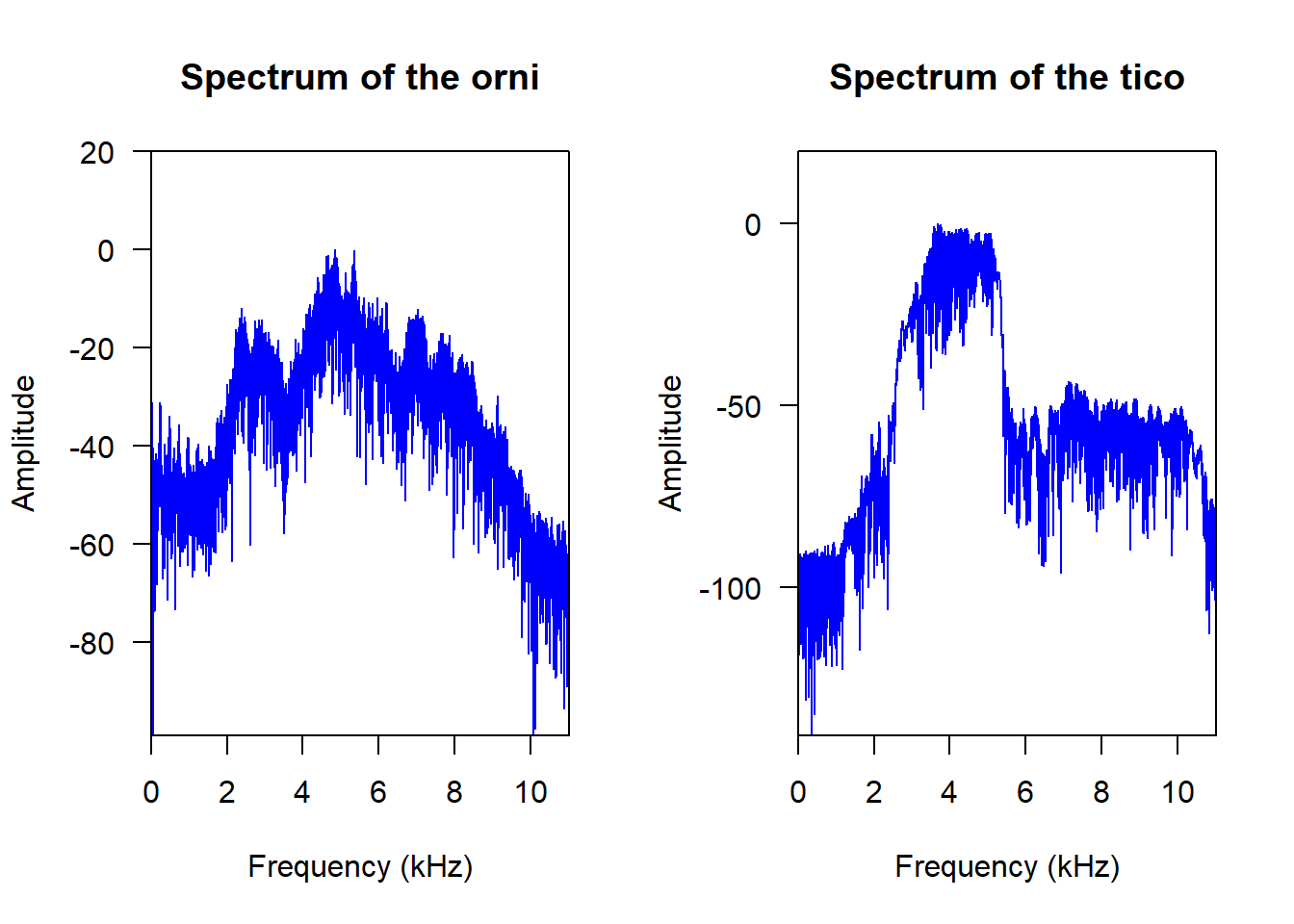
par(opar)오디오 퓨리에 변환 시각화 하기
opar <- par(mfrow = c(1, 2))
wf(orni, f=22050, ovlp=50, hoff=0, voff=2, border="#00000075",
   main="waterfall display of the orni")
wf(tico, f=22050, ovlp=50, hoff=0, voff=2, border="#00000075",
   main="waterfall display of tico")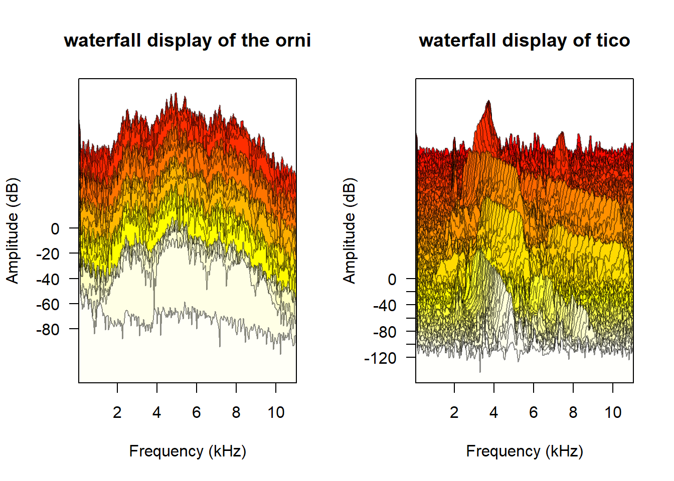
par(opar)